Write your CSS
We want the pf-v5-cool-element to have a profile photo, a username, and a follow button.
Right now, it only contains the HTML structure, but we can style our element by
updating our CSS to make it look the way we want.
We'll be working in the pf-v5-cool-element.css file.
The boilerplate stylesheet has a :host selector that makes our element display
as a block element.
:host {
  display: block;
}
Now we can update our styles, like so:
:host {
  display: inline-flex;
  flex-direction: column;
  align-items: center;
  justify-content: center;
  border:
    var(--pf-global--BorderWidth--sm, 1px)
    solid
    var(--pf-global--BorderColor--100, #d2d2d2);
  padding: var(--pf-global--spacer--xl, 2rem);
  margin: var(--pf-global--spacer--md, 1rem);
}

:host([hidden]) {
  display: none;
}

#profile-pic {
  width: 60px;
  height: 60px;
  margin: var(--pf-global--spacer--md, 1rem);
  border:
    var(--pf-global--BorderWidth--sm, 1px)
    solid
    var(--pf-global--BorderColor--200, #8a8d90);
  border-radius: 50%;
  background-color: var(--pf-global--BackgroundColor--200, #f0f0f0);
}
After saving and viewing our demo page, our profile element looks much better.
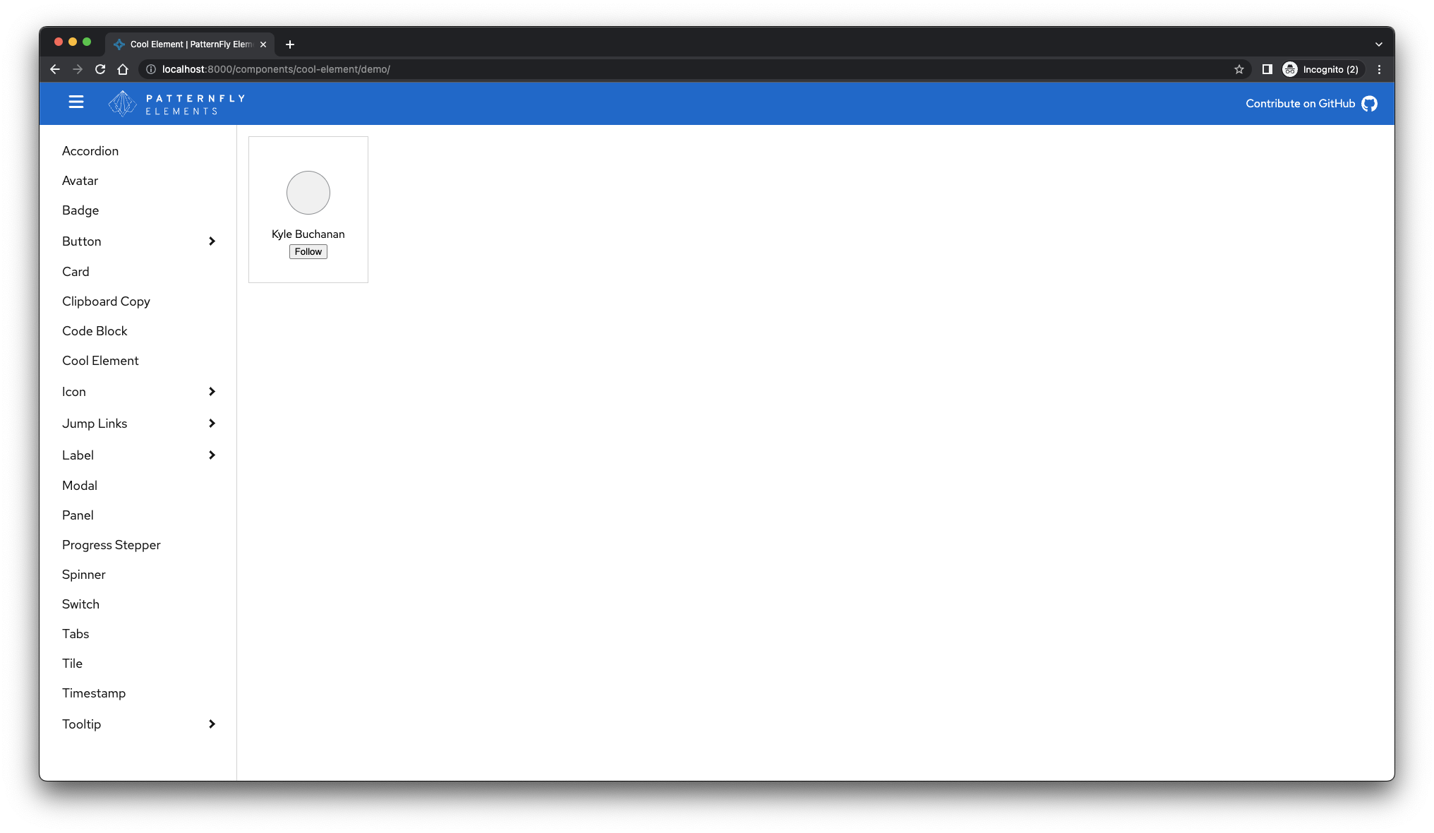
A couple of things to note:
- The
:hostselector sets the styles of the container element<pf-v5-cool-element>. - The
buttonstyles are encapsulated within this element and will not bleed out, meaning that there's no chance these styles will affect other buttons on the page. Feeling confident that your element will always look the same when it's distributed is one of the main advantages of the shadow DOM. Check out the Styling section of Shadow DOM v1: Self-Contained Web Components to learn what else you can do when applying styles to the shadow DOM.
Now that our pf-v5-cool-element is more appealing, we'll add the follow button's interaction
and fill in the profile photo.
We can accomplish both of these tasks by updating the pf-v5-cool-element.ts file.
